Gapminder
Written on 9:52 AM by nitesh
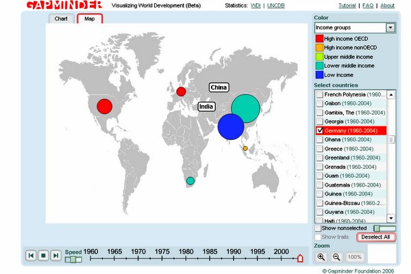
It is a development –statistics visualization tool. The application is developed for showing the development indicators for all the countries in a graphical way.
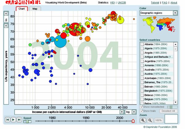
In the scattered plot each country is represented by a bubble, size of the bubble depends on the population of the country.
Per capita income in international dollars in X-axis and life expectancy, years in Y-axis are default indicators. One can change the default indicators to others (like child mortality rate, military budget of the total budget) by selecting from the drop down list in both the axis.
Moving mouse above the bubble gives the values on the axes
Countries can be looked up in three different ways
- Geographic regions
- Income groups
- Indebtness
When one select say south asia in geographic region category all the countries in the south asia gets highlighted. To see the change in values during the last few decades there a play option in the bottom. There are two viewing options chart and map. In map all the countries are shown in a globe and in chart they are shown in a graph.
There are many other options in it so go give a try to have fun with statistics.
![]()